Juri
Juri is a craft and livelihood initiative developed under the North Tripura Rural Livelihood Mission, bringing together locally made textiles, handicrafts, fragrances and other products from women-led self-help groups across North Tripura.
I developed the visual identity for Juri, including the logo, colour system, packaging and foundational brand guidelines. The identity needed to work across a wide range of products, from agricultural produce and packaged foods to textiles and handmade goods. Rather than building the brand around a particular craft or product category, the approach was to create a flexible visual system that could accommodate this diversity while maintaining a consistent identity.
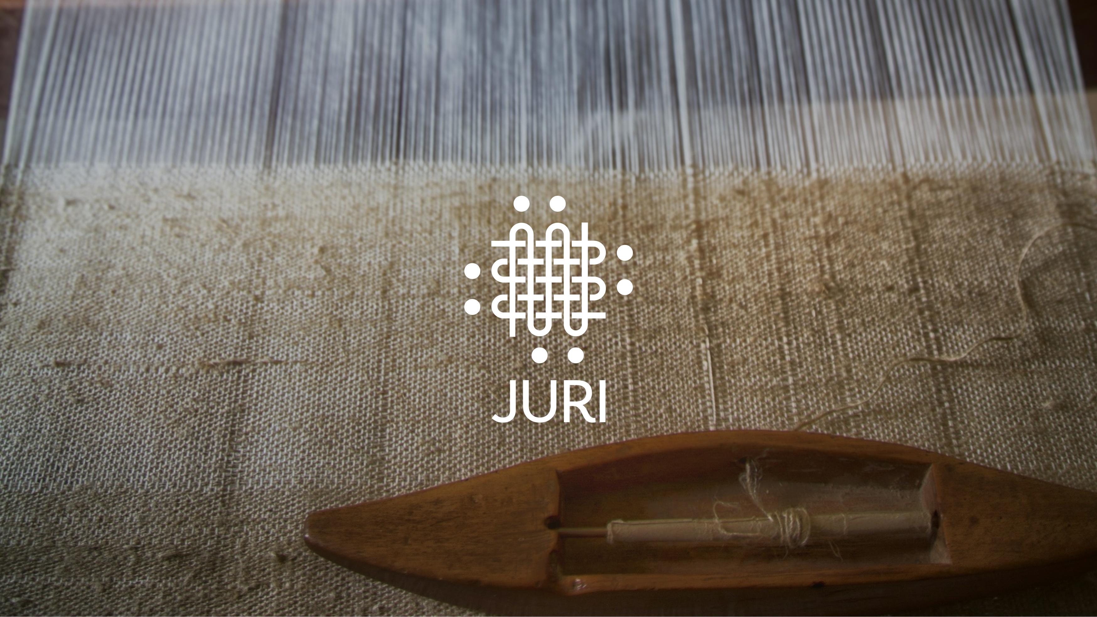

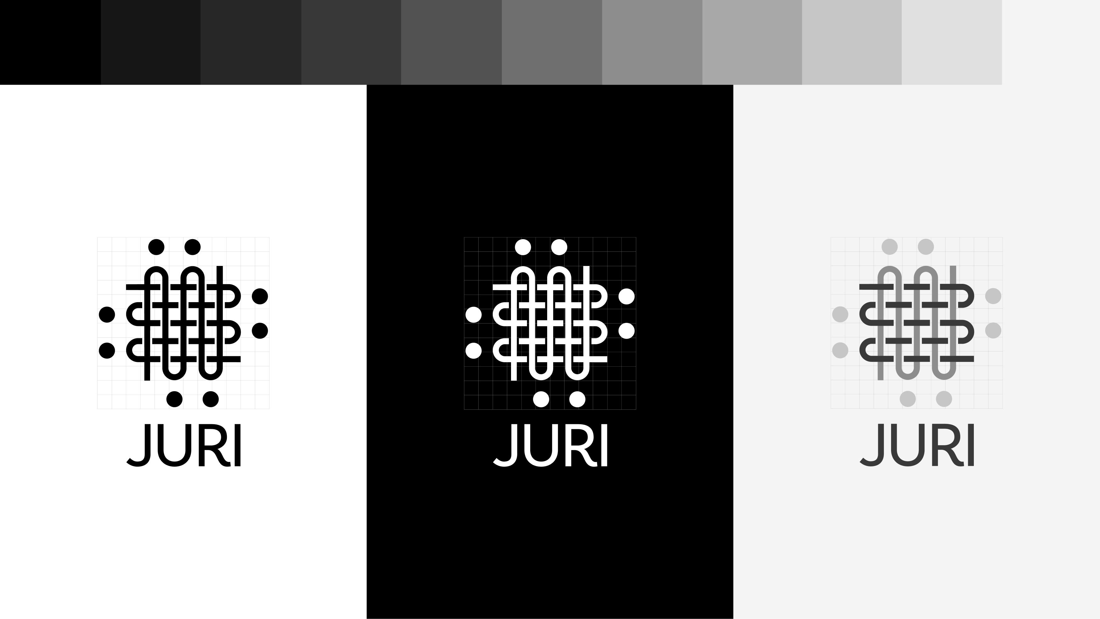
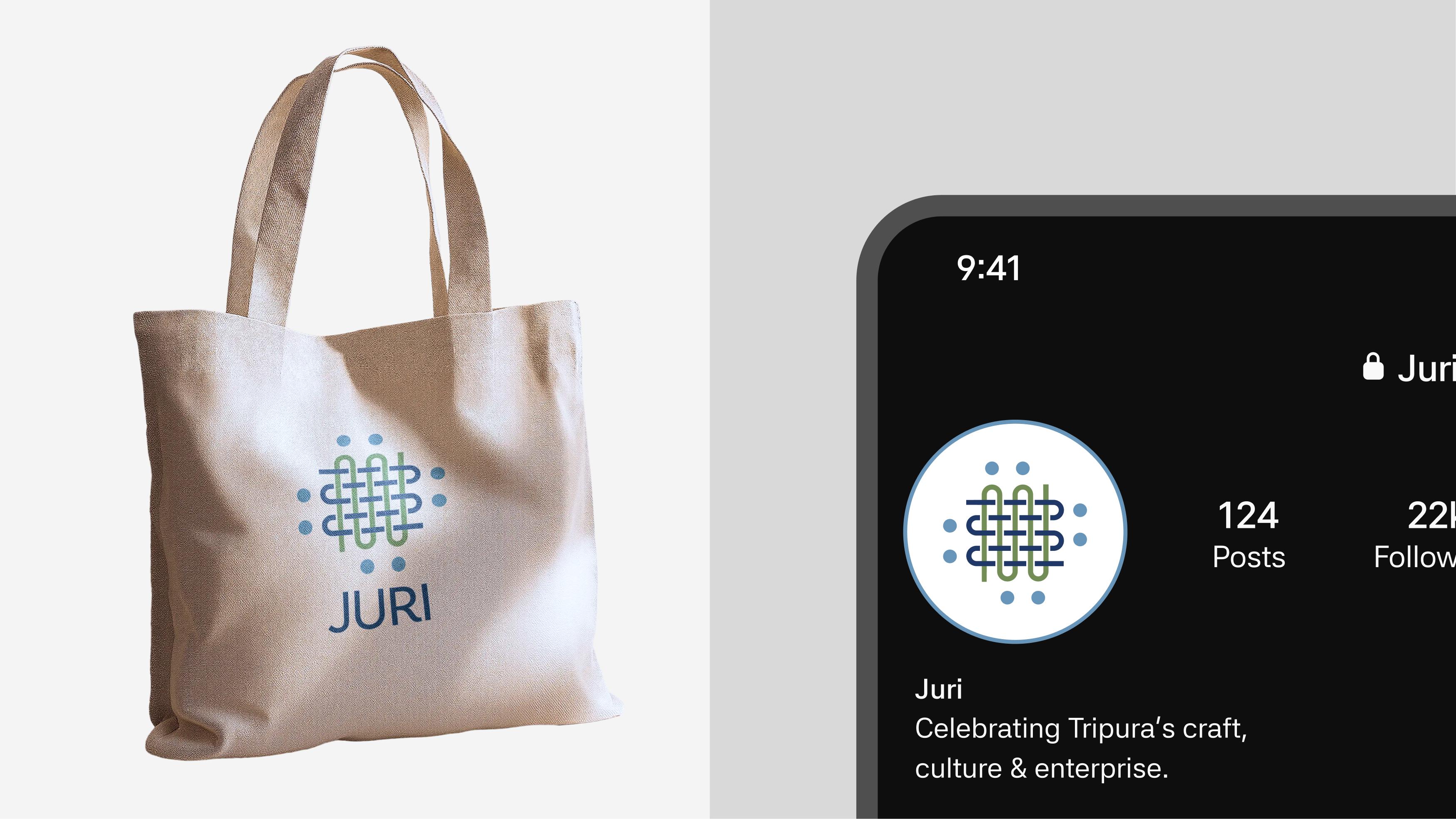
The symbol draws from the structure of traditional weaving, using interlocking forms to represent the coming together of people, skills and livelihoods. Its geometric construction allows it to function as both a recognisable mark and a repeatable graphic element across different applications.

The standalone wordmark provides a clean, highly legible identity for official documentation, government letterheads, and small-scale media where the emblem is omitted. Set in a custom rounded sans-serif, the proportioned stroke weights echo the smooth curves and continuous loops of the primary weave emblem. The open, sweeping leg of the letter 'R' gives the logotype a memorable, human character, balancing institutional trust with an approachable craft aesthetic.

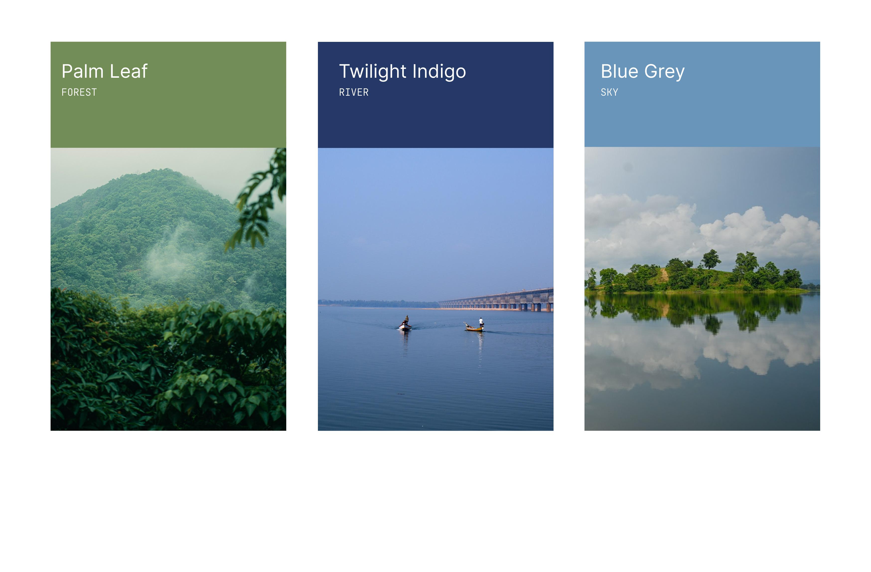
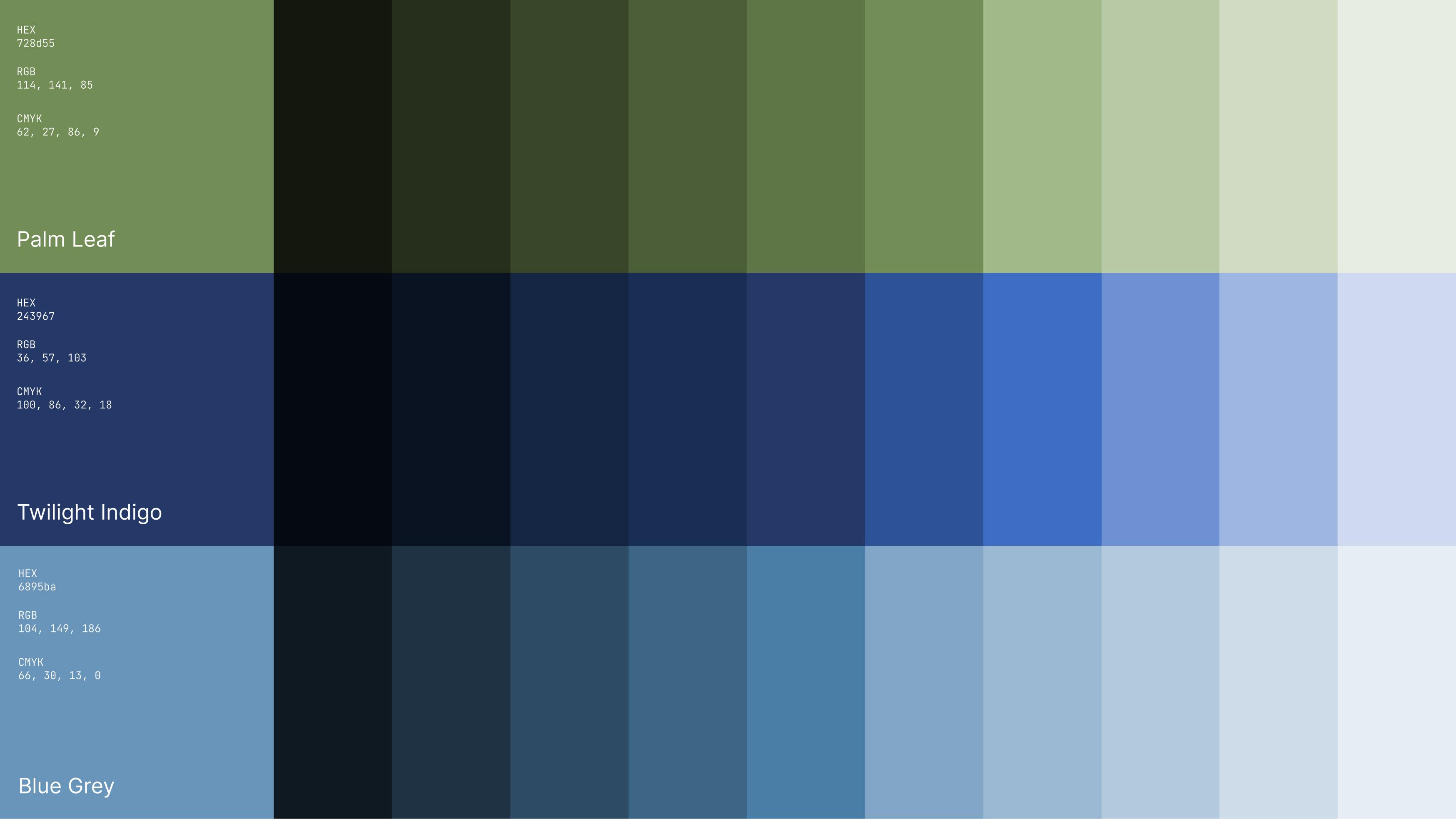
The colour palette takes its cues from Tripura's natural landscape, particularly its forests, hills and waterways. Three primary colour families establish a connection to the region, while their extended shades provide flexibility across packaging, print and digital applications.
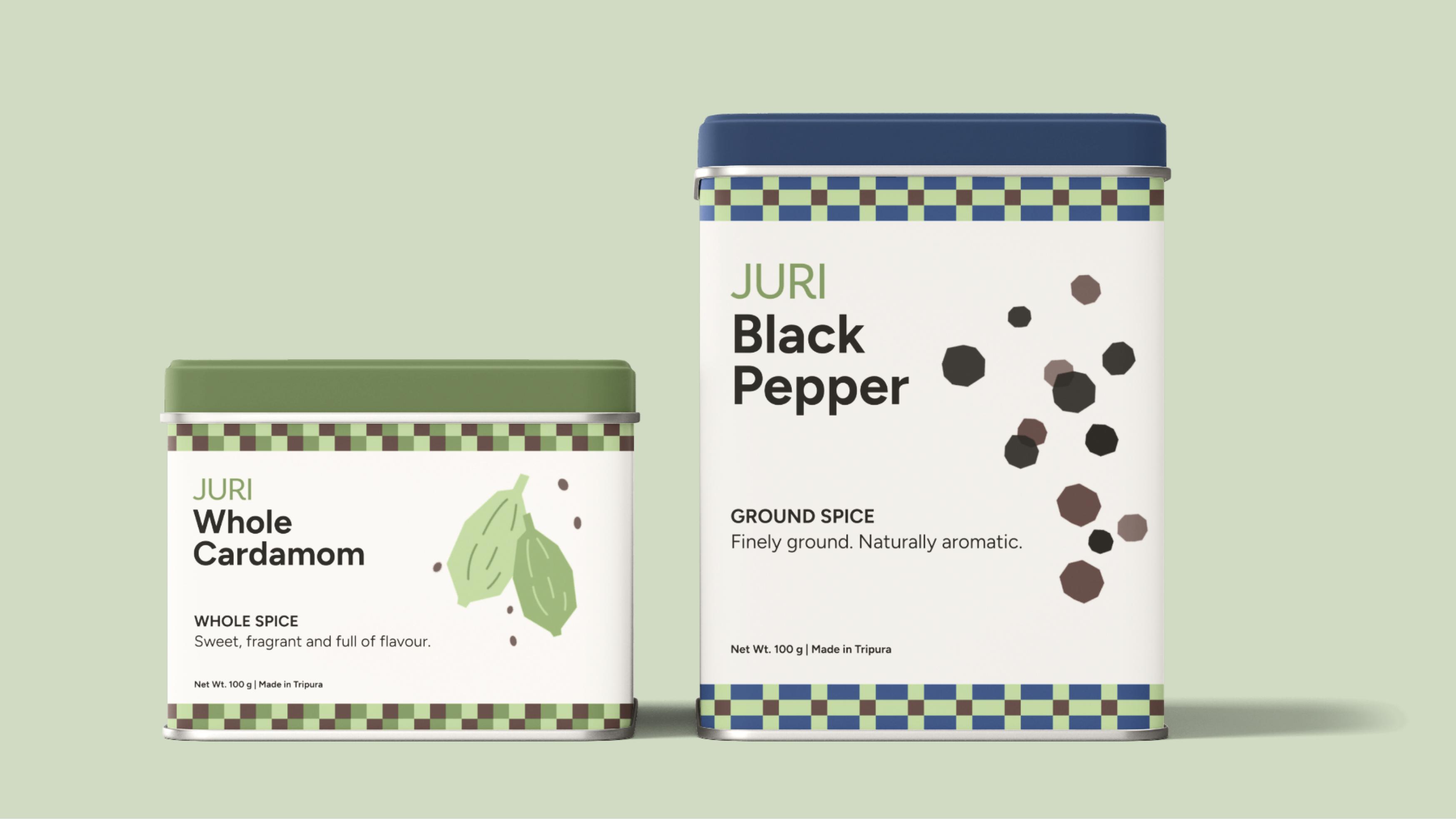
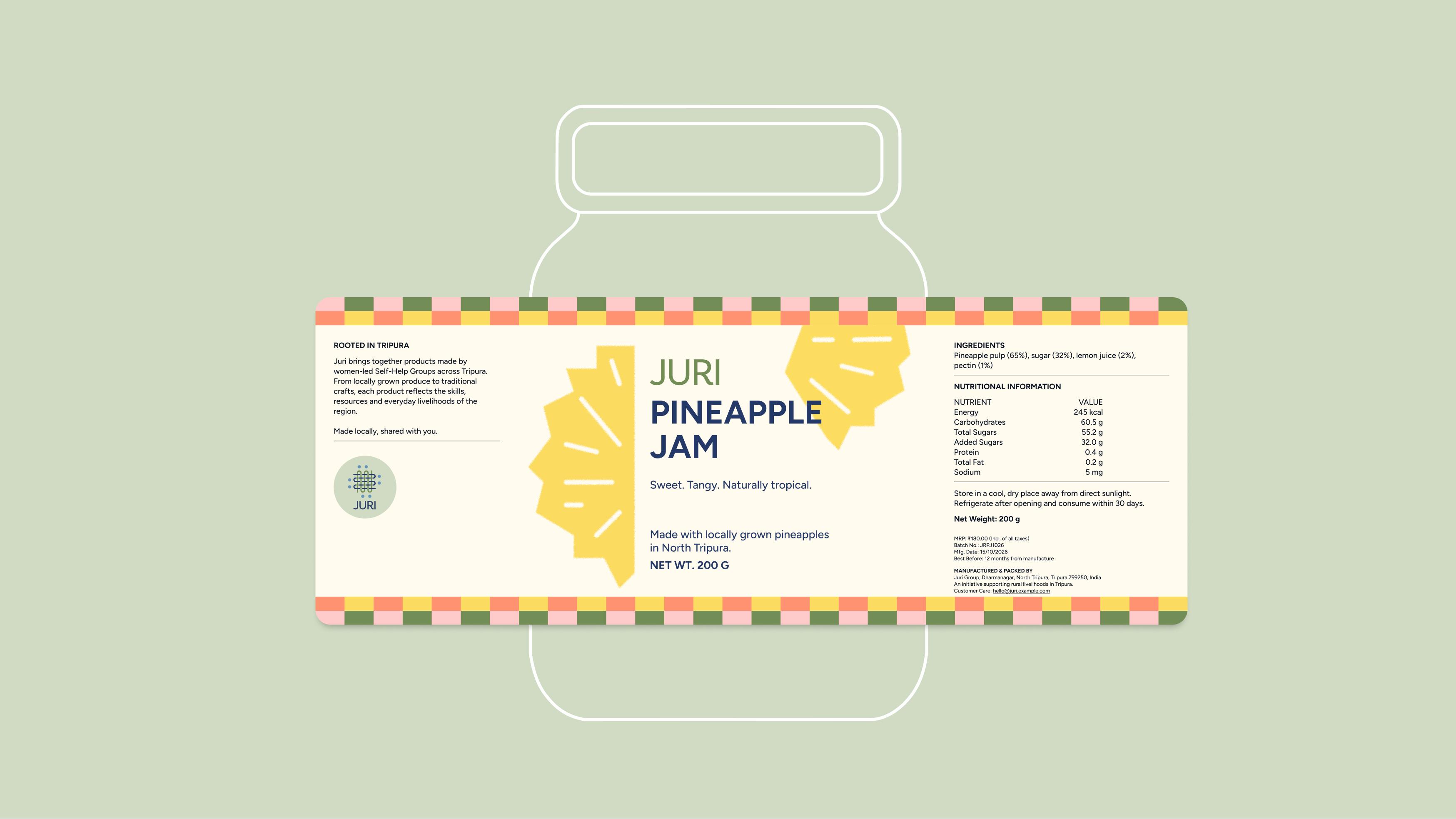
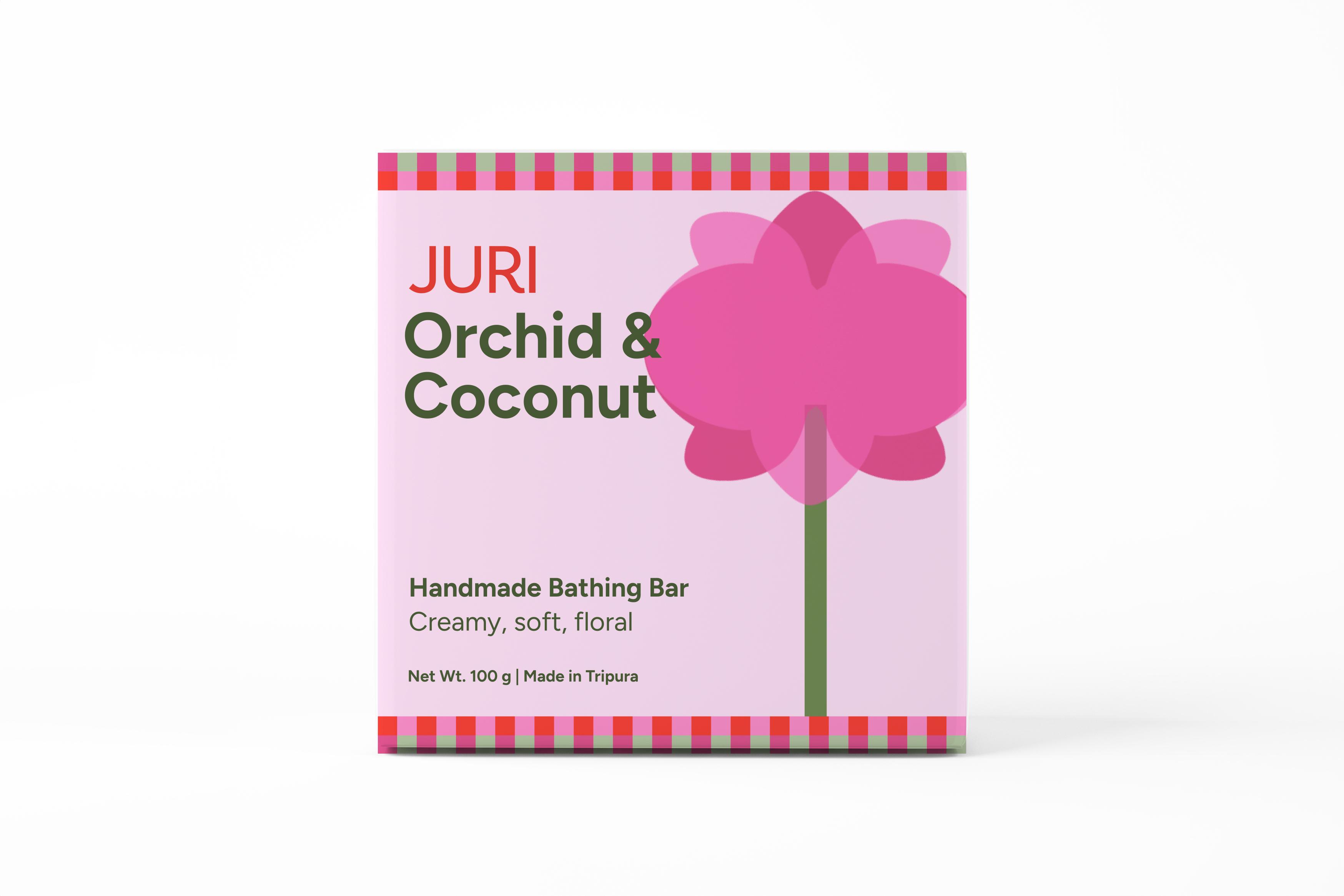
The packaging system was designed to accommodate different product categories while maintaining a consistent brand identity. Patterns derived from traditional weaving practices of Tripura bring a regional connection to the packaging. Their scale, placement and application vary across products, allowing for more expressive designs on handmade soaps and a restrained, information-led approach on food packaging. A shared typographic hierarchy, colour system and recurring brand elements bring consistency across the range while giving each product its own character.
At its core, Juri is about giving locally made products a stronger presence in the market, without losing sight of where they come from.
Team
Shreya Kulkarni